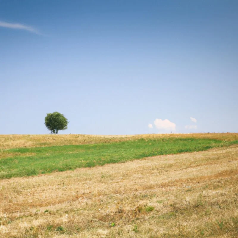
I've spent years capturing the earth's vast beauty through my lens, and I've learned that a great landscape photo isn't just about what you see—it's how you frame it.
That's why I'm sharing my top five framing rules that'll give your shots the power and presence they deserve.
Whether you're a seasoned pro or just starting out, mastering these techniques will transform your photographs into captivating works of art.
Get ready to take control of your landscape photography!
Table of Contents
ToggleThe Rule of Thirds
The Rule of Thirds is a compositional guideline I always consider when framing a landscape shot. It's about dividing the frame into a three-by-three grid and placing the most important elements along these lines or at their intersections. This technique gives me control over the viewer's eye movement and creates a balanced, aesthetically pleasing image.
I don't just guess the placement; I use my camera's grid feature to ensure accuracy. It's not just about symmetry; it's about making the scene dynamic. By positioning key features off-center, I'm able to craft a photograph that feels both grounded and full of motion.
Mastering this rule empowers me to take compelling landscape photographs that command attention and convey the essence of the scene with authority.
Leading Lines Technique
After mastering the Rule of Thirds, I've found that incorporating the Leading Lines technique significantly enhances the depth and directionality of my landscape photos. This approach empowers me to guide the viewer's eye through the scene, establishing a path that naturally leads to the photograph's focal point.
Here's a concise table to highlight how I take control of the viewer's attention:
| Leading Line Type | Effect on Viewer's Focus |
|---|---|
| Roads or Pathways | Drives toward horizon or destination |
| Rivers or Shorelines | Steers along the natural curves |
| Architectural Lines | Directs to key structures |
| Fences or Rows of Trees | Channels along the repetitions |
Natural Framing Method
Building on the concept of guiding the viewer's eye, I've discovered that the Natural Framing Method adds a layer of depth and focus to my landscape shots. By harnessing elements within the environment, I create a ‘frame within a frame' that leads to compelling compositions. It's a powerful tool that grants me command over how a scene is presented and perceived.
Natural Frames I Use:
Overhanging branches
Window-like gaps in rocks
Tunnels of foliage
These elements draw the eye inward, magnifying the subject's impact.
They enhance the sense of discovery, as if unveiling a hidden gem.
The framing can stir a feeling of being enveloped in nature, a technique that resonates with viewers seeking a connection to the natural world.
Horizon Placement Strategies
While exploring horizon placement strategies, I've learned that the position of the horizon in a landscape photo can dramatically alter the photograph's balance and meaning. Placing the horizon high gives prominence to the foreground, inviting viewers to focus on details and textures up close. Conversely, a low horizon opens up the sky, often conveying a sense of vastness or highlighting dramatic cloud formations. It's essential to keep the horizon level to avoid a disorienting effect; an unlevel horizon can unsettle the viewer and detract from the image's impact.
I've also discovered the power of breaking the rule of thirds when the scene calls for it. A centered horizon can work exceptionally well with reflections or symmetrical compositions, giving a photo equilibrium and tranquility.
Balancing Elements Effectively
Having explored horizon placement, I've realized that every element in a landscape photo must be balanced to achieve a harmonious composition. It's not just about symmetry; it's about creating a visual equilibrium that guides the viewer's eye and evokes a profound emotional response.
Here's how I ensure balance in my landscape photography:
- Visual Weight: Even a single tree can anchor a scene.
- Large Elements: A splash of color adds weight without bulk.
- Color Intensity: Light areas draw attention and balance dark spaces.
Mastering this balance gives me control over the narrative of the image. It's about making deliberate decisions that resonate with viewers, instilling a sense of tranquility, awe, or wonder.
This control is empowering, allowing me to craft landscapes that aren't only seen but felt.
